Tyler
Joseph
Pawlak

PORTFOLIO

Welcome to my portfolio. For the full effect, I ask that you please enable audio. Audio can be also be toggled at any time during your visit.

Designer & Front-End Developer

W.Bradford

Rebrand and Digital Assets

Designer & Developer | W.Bradford
Branding | Web Design & Dev | Social Media

The Problem:
We aimed to rebrand our agency with a fresh look and feel that better represented who we were as a company and what we wanted to show to the world. We had established a logo months prior to launch, but needed a creative direction that would amplify our creative message to show what we could deliver to our clients.

W.Bradford

Rebrand and Digital Assets

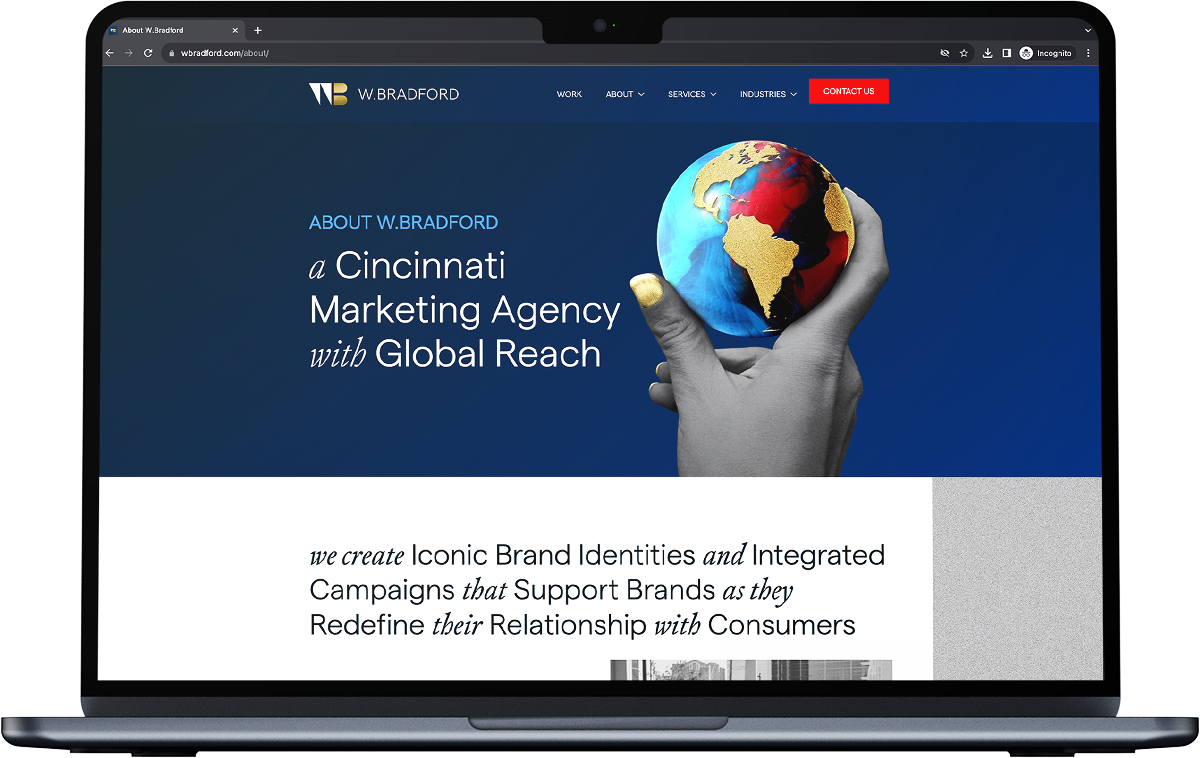
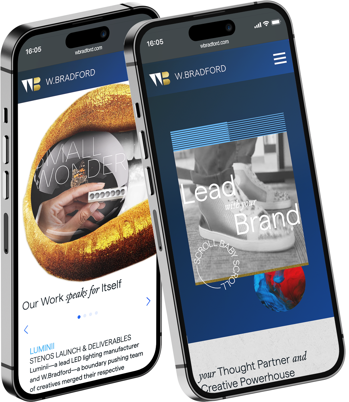
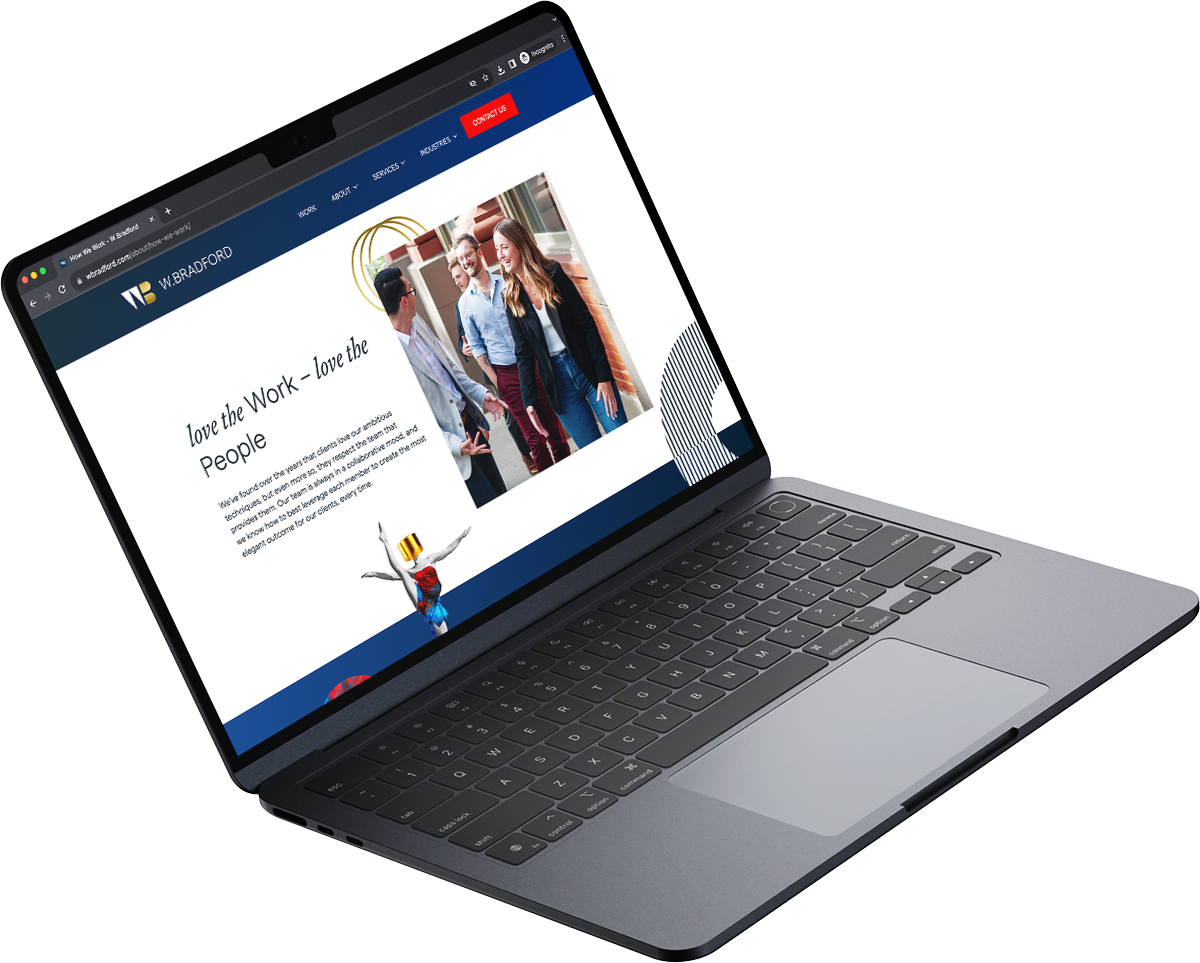
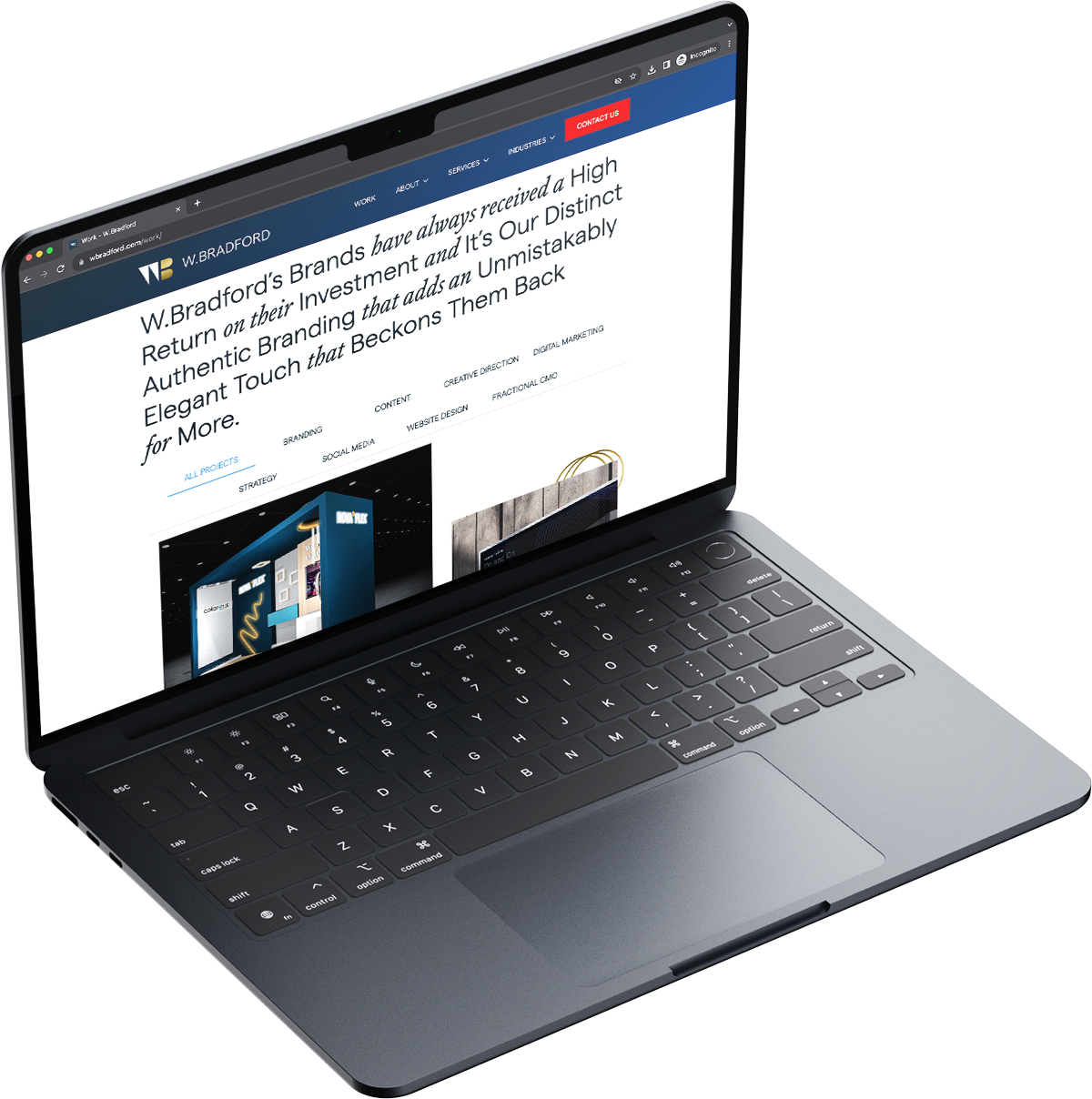
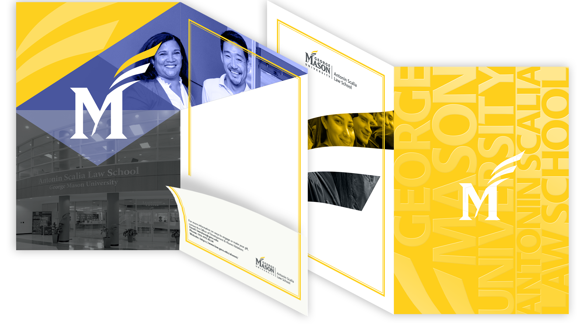
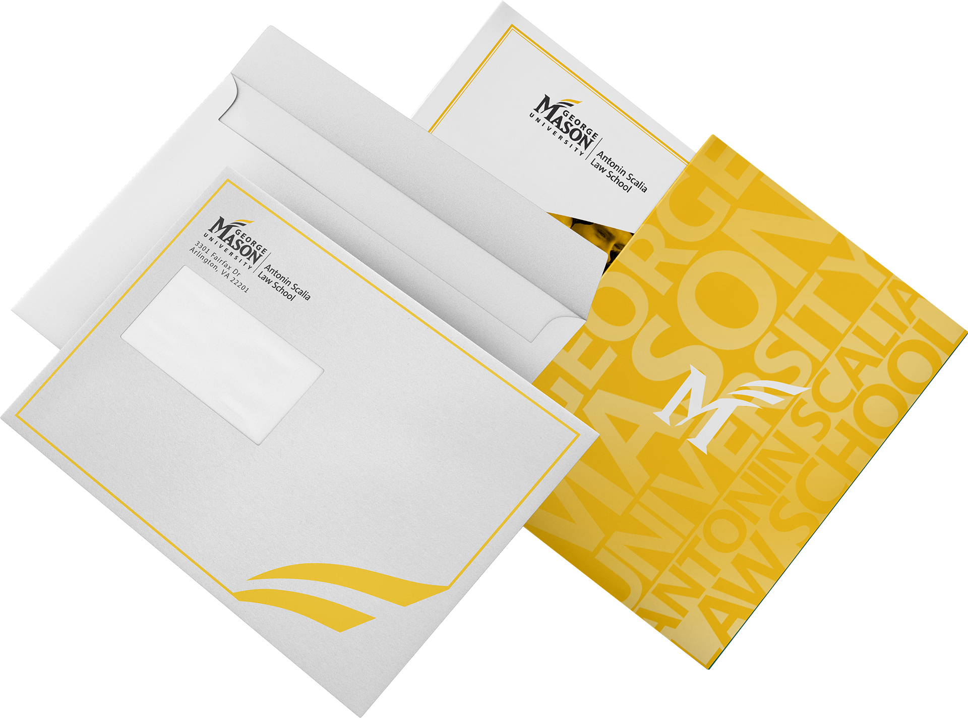
The Solution:Given my experience in interactive design and website development, I was tasked with the design and development of the new site. The brand was developed to the point where we had a logo and some general shapes and patterns we wanted to use.

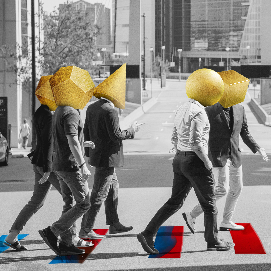
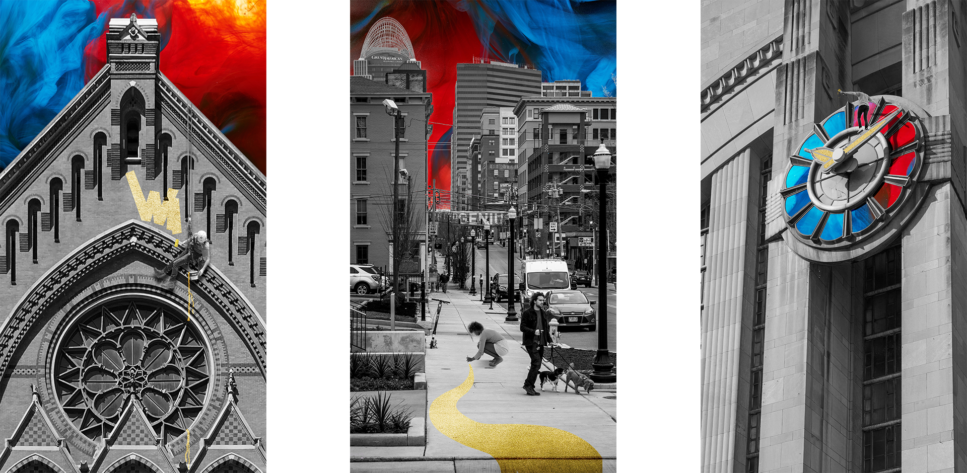
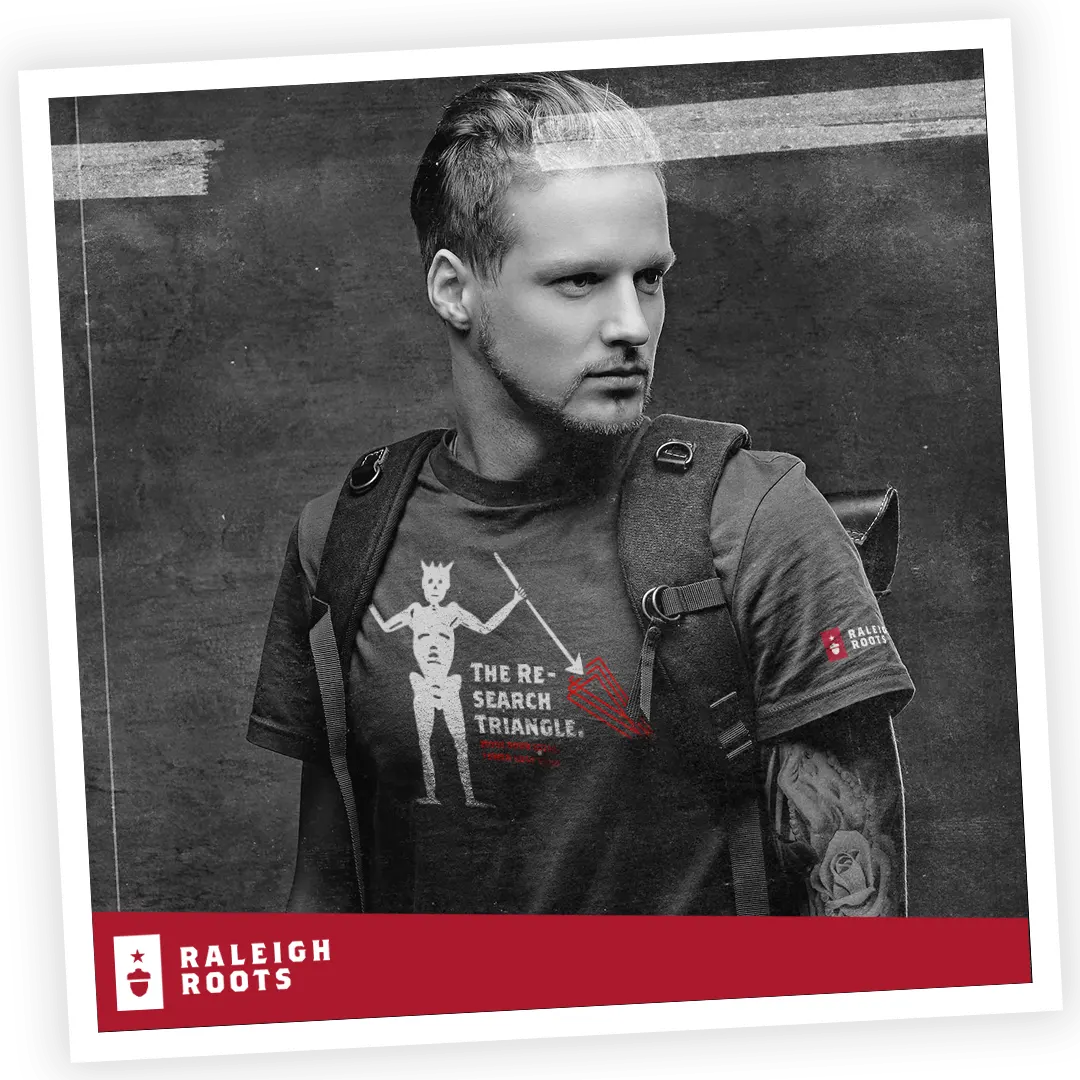
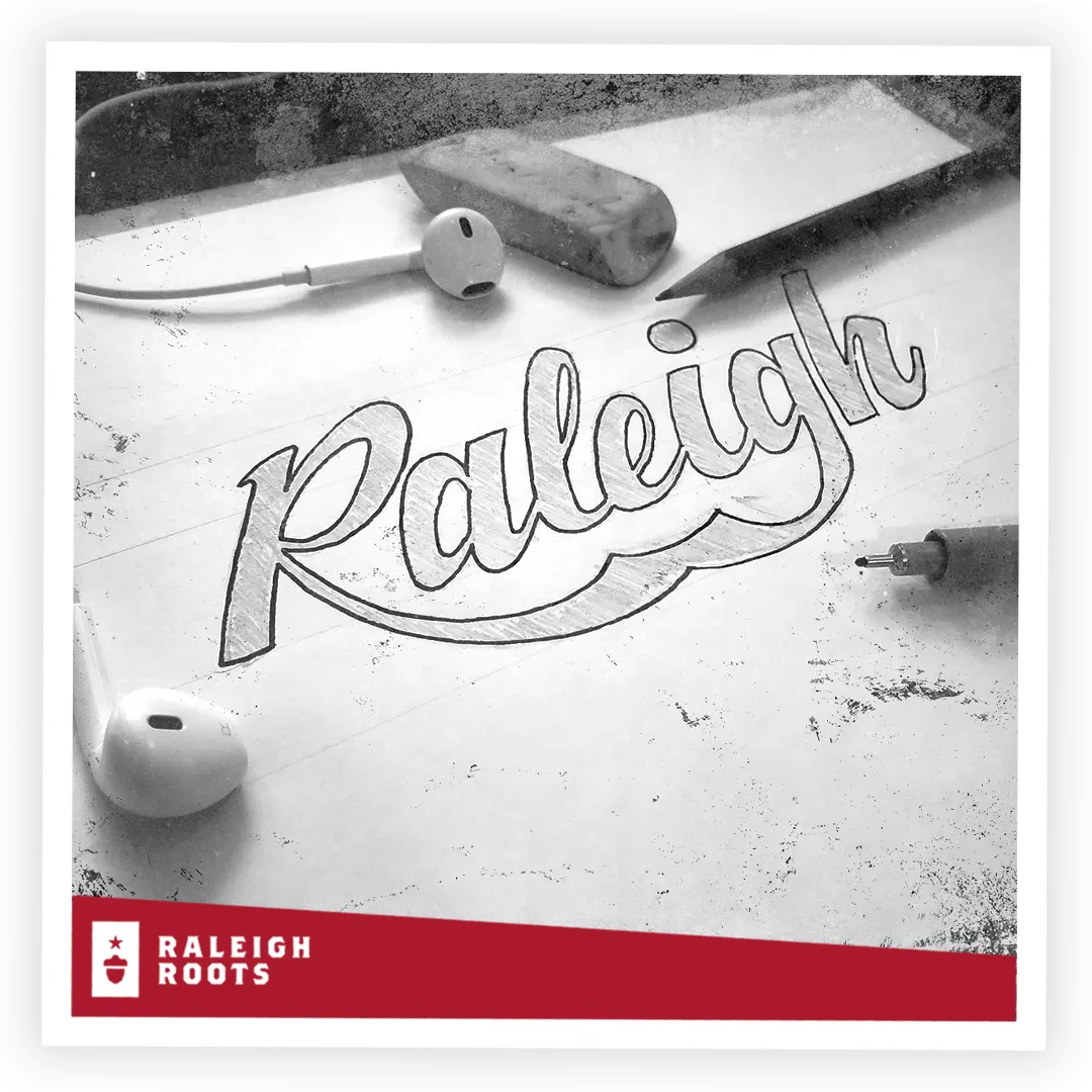
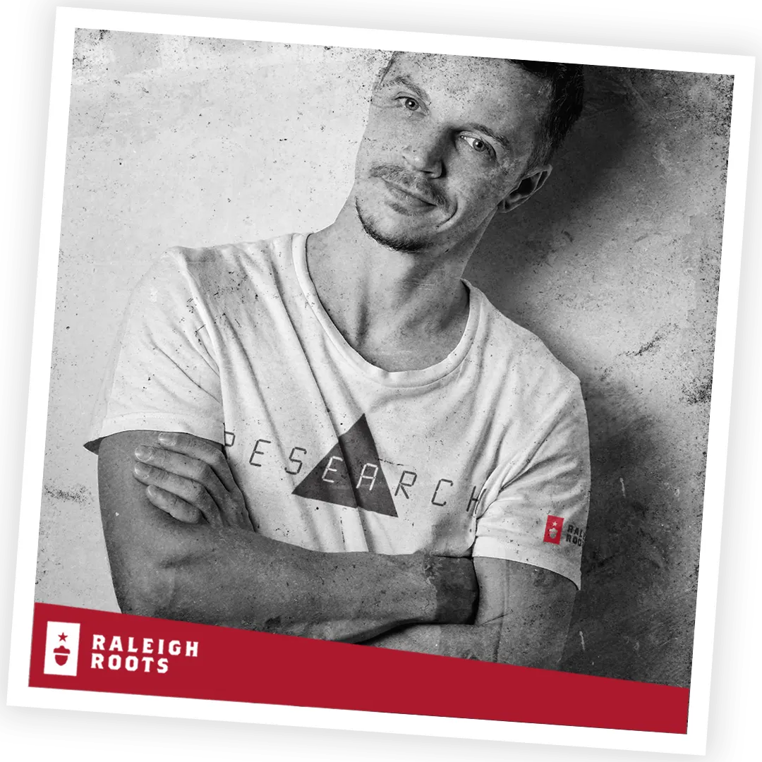
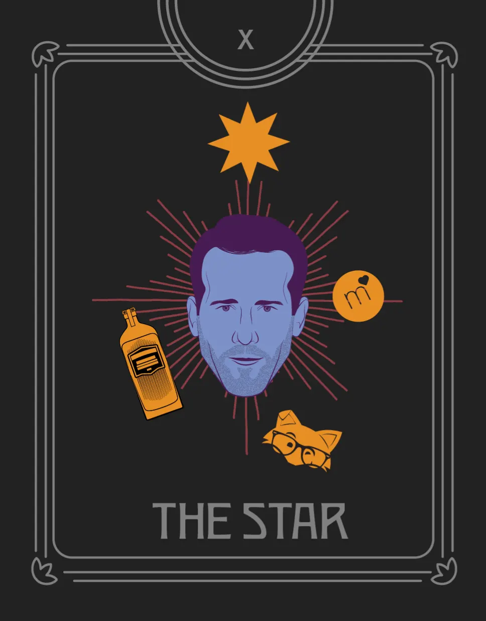
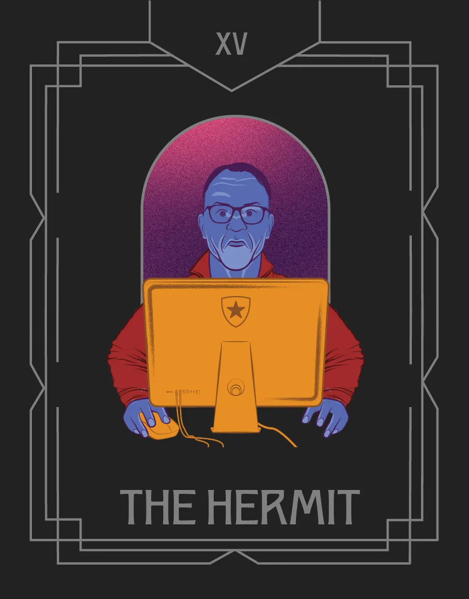
From this, I made a system of photo treatments, graphical elements, and typographic pairings to fully flesh out the look and feel of the brand. This was done by heavily leaning into the gold swatch and applying it as a highlight to a wide variety of images and surrealist elements. This came in the form of things like a series of black and white figures with gold polyhedron heads, hands with gold nail polish, a suited man with a retro tv for a head with gold buttons, and even a pair of oversized gold lips that became somewhat of a mascot for us. These more maximalist elements were paired with smooth, subtle gradients, clean vector patterns, grayscale noise patterns and clear contrast. This pairing of extreme and refined created a unique system that showed a base of classic design pricipals with a wild side of creative chaos.

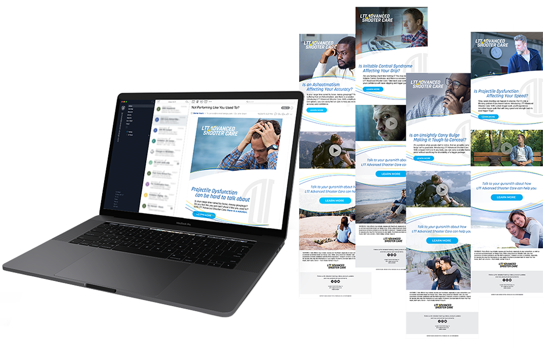
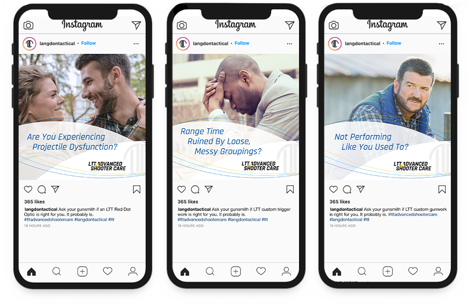
After the website was designed and developed, I transitioned to creating some digital assets to share on social media to announce the new branding. This came in the form of a few videos as well as static images.

GMU Antonin Scalia Law School

Fall Alumni Mailer

Designer | REVERED Agency
Envelope | Folder | Dean Letter | Return Slip

The Problem:
Antonin Scalia Law School wanted to create a mailer to send to alumni to encourage engagement and donations. The envelope and folder had to be designed as to not be specific for this campaign so that it could be used in future projects.

GMU Antonin Scalia Law School

Fall Alumni Mailer

The Solution:Working within the brand guidelines for the university, we created a dynamic design that was eye catching to help it stand out in the recipient’s mailbox. Elements of the university’s logo were isolated to create a mark that was repeated throughout the design. Yellow, blue and gray were selected to differentiate the law school from the traditional green employed by the stylings of the main university. UV spot printing was on the cover to give depth to the design while still allowing us to almost cover the front entirely with the bright, yellow color. Photography of students and the library helps to remind alumni of their time at the law school and establish an emotional connection.

Raleigh Roots

Website, Branding, and Social Oh My!

Designer & Developer | W.Bradford
Branding | Web Design & Dev | Social Media

The Problem:
My Creative Director came to me with a napkin idea for an apparel company that he wanted to start. Knowing that I had worked as a web developer for an apparel company before, he tasked me with designing and developing the website, as well as setting up fulfillment.

Raleigh Roots

Website, Branding, and Social Oh My!

The Solution:After running through a similar process to what we gave our clients, we came to a solid direction on how our own agency would show itself to the world. We ended up combining maximalism and minimalism by using the graphic elements to push the limits of creativity while building the visual structure on a solid base of a clean (if incossistent) grid, visual contrast, and

Langdon Tactical Technology

Pharma Campaign

Designer | REVERED Agency
Video Ads | Social Media | Emails

The Problem
Our agency recognized LTT’s place in the market as a firearms company and wanted to create a memorable campaign to set them apart. Advertising in the firearms world typically walks the same path over and over so we felt the need to blaze a new trail.

Langdon Tactical Technology

Pharma Campaign

The Solution:We decided that the best solution was to advertise the company by keeping their product out of the spotlight and instead focus on a humorous take on a pharmaceutical ad. These ads would not include any imagery of firearms or anything that could be associated with them. Instead, clever voice-over work would imply the nature of the company in a way that would make the company stand out among the competition. This also bled into the social media aspect of the campaign where stereotypical images normally found in pharmaceutical ads would be paired with copy asking, for instance, if you were experiencing “projectile disfunction.” This proved successful in helping LTT expand their audience.

Odds & Ends

What Are These?
Not everything I make is a part of a large campaign or for a client. Here is a collection of some things I’ve made that are either for in-house marketing, one-off projects, or even just for fun. Often these have been less restrictive and have even into some of the more fun projects to work on, so I felt the desire to include them in my displayed works.

Odds & Ends

STENOS Landing Page | W.BradfordThis was for a client, but I mainly touched this landing page so it lives in Odd & Ends. The whole landing page was designed and developed by me. The aim was to showcase the client's products in a new and innovative way that implimented some new design techniques that place them miles above their competition.

Virtual Tarot Cards | REVERED AgencyAs a fun way to engage both potential and current clients during the Fall, our team produced a set of tarot cards with a marketing theme that would give clients a view into the future of their business and how we could address their marketing needs. A virtual experience was created to be used in an email campaign and expand the reach of the campaign. Many businesses were still working from home and this gave those in that situation an opportunity to have the experience even if they had not gone to the office to check for our physical cards in the mail.

State of Marketing | REVERED AgencyThis was a set of emails that was designed to highlight our agency's capabilities by using Hubspot's State of Marketing Report to show ways that brands can improve their advertisementing. Movement was added to the top of the emails to grab the attention of the viewer and create interest in our message.

Littlefoot Left Behind | REVERED AgencyLittlefoot started as a weekend project to see if I could create a connection between my love of web development and one of my old hobbies from my youth (programming video games). After creating a working prototype, I started working in branding for REVERED and pitched the idea of using the game as a marketing tool. It was then greenlit to be used as a fun way for potential clients to interact with our brand in tandem with a bigfoot plushy toy that was already in use.

Custom Link Tree | REVERED AgencyOur agency started using NFC tokens as a paperless business card option, but wanted more branding and customization than something like Linktree offered. I made custom pages on our website for members of our staff and their unique wants and needs. These not only included links to social media pages, but also employee information and buttons to email, call, or even set up a meeting.

Nine Line Cigars | Nine Line ApparelAn opportunity came up for Nine Line to work with a large cigar manufacturer to create a line of branded cigars to sell in retail stores. The design married Nine Line’s patriotic and military focused aesthetic with more traditional cigar design. The box was modeled off an ammo box in a dark green with gold foil accents. Inside of the box was a card that had the tenets of Nine Line on the front and cigar measuring tools on the reverse side. The cigar bands reflected the design of the box itself with the illustration paired with green and gold.

Nine Line Cocktail Book | Nine Line ApparelTo find a happy medium between my current job at the time (graphic designer) and my job before that (bartender), I pitched the idea for a cocktail book to be sold as a standalone item as well as in a bundle with other drink related products. The book contained over 50 patriotic related cocktails that covered every major liquor category. Much of the design was hand drawn to give the recipes and category pages a personal touch and feeling. A stylized typeface was paired with a more legible sans-serif for the directions.

Tyler
Joseph
Pawlak

W.Bradford

Design Director
APR 23
PRESENT

REVERED Agency

Designer
AUG 21
APR 23

Nine Line Apparel

Designer & Front-End Developer
FEB 20
AUG 21

South Magazine

Freelance Designer
SUMMER 19